All May Not Be As It Seems
Robin Kingsmill - May 06, 2015
The line on the graph may appear to be a gentle rise, but in actuality the yield went from .79% to 1.19%
Click Here to Read Original PDF
(May 2015)
The line on the graph may appear to be a gentle rise, but in actuality the yield went from .79% to 1.19%
All may not be as it seems
We’ve all heard the talk about dropping interest rates … what happens if they were to rise? What if? This chart reviews one month: April 14 to May 14, 2015 and shows the 5-Year Canada Bond Yield.
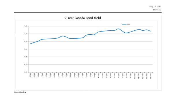
The line on the graph may appear to be a gentle rise, but in actuality the yield went from .79% to 1.19%. A 50% rise? That is a significant move that no one is talking about. This rapid rise in such a short amount of time should trigger a comment - yet we haven’t heard much.
We think this would be a good time to take a look at any lower yielding Preferred shares in your portfolio. Should interest rates rise with them still in your portfolio, there are some that could catch like a boat anchor.
We are The Kingsmill Saar Wealth Management Group. Thank you for taking the time to read the Income Advisor today. Call us! Let’s be proactive.