Canada Versus the Rest of the World
Igor Manukhov - Nov 24, 2023
Stocks continue to outperform bonds. The US is still the top performer.
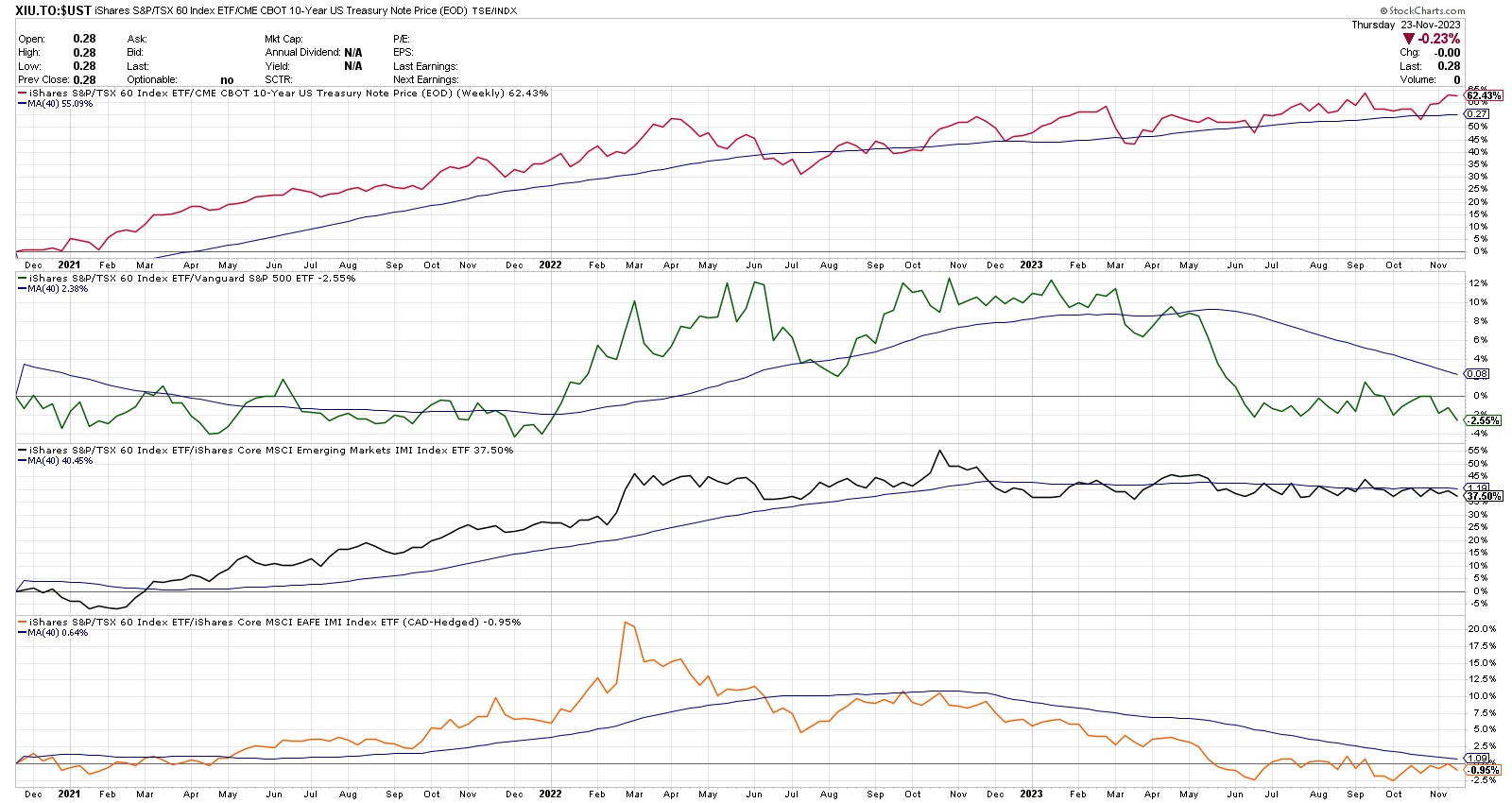
The stock market continues to rebound. As we approach the end of the year, it is useful to get a sense on where we stand. Below are relative strength charts comparing various regions to one another. I will go through the charts from top to bottom.
- The red line on the top panel shows relative strength between Canadian stocks and bonds. A rising line indicates that stocks continue to outperform bonds. That is what you want in a bull market.
- The green line compares Canadian stocks to US stocks. A falling line indicates that US stocks outperform their Canadian counterparts. The outperformance is quite significant as well.
- The black line on the third panel compares Canadian stocks to Emerging Market stocks. There is virtually no difference in their performance this year. There is slight edge to Emerging markets (the line declines if emerging markets outperform Canadian stocks)
- Last but not least is the orange line that compares Canadian stocks to EAFE stocks (EAFE stands for Europe, Australia & the Far East). This index tracks International Markets outside of North America. Currently EAFE is outperforming Canadian Stocks as you can see by a downward sloping orange line.
This simple but very powerful comparison process is very helpful in determining asset allocation. Based on this information, we currently overweight stocks vs. bonds. We also underweight Canadian equity in favour of US.
